


The Psychology of Color in Web Design: How to Influence User Behavior
Lets talk about how color captivates the mind!
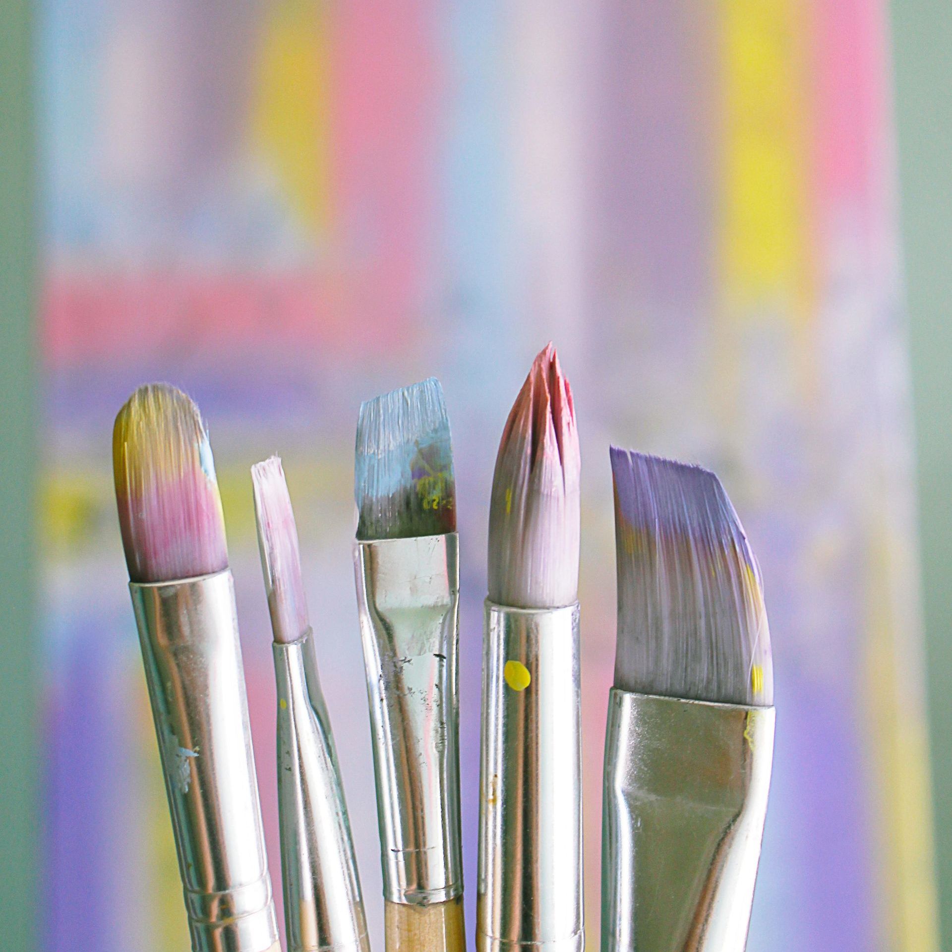
Color is one of the most powerful tools in a web designer’s arsenal. It has the ability to influence emotions, direct attention, and even impact decision-making. Understanding the psychology of color can help designers create more effective websites that engage users and drive desired actions. In this blog, we’ll explore how different colors affect user behavior and how you can strategically use them in web design.
The Psychology of Color in Web Design: How to Influence User Behavior
Understanding Color Psychology
Color psychology is the study of how colors impact human emotions and behavior. Different colors evoke different feelings, and these associations can vary based on cultural influences, personal experiences, and context. When used strategically, colors can enhance user experience, increase conversions, and strengthen brand identity.
Common Color Associations in Web Design
Here are some common psychological associations of colors and how they can be used effectively in web design:
1. Blue – Trust and Professionalism
Blue is one of the most widely used colors in web design, especially for corporate and technology websites. It conveys trust, reliability, and calmness. Many banks, healthcare providers, and social media platforms (such as Facebook and LinkedIn) use blue to establish credibility and security.
Best used for: Financial institutions, tech companies, healthcare, and corporate websites.
2. Red – Energy and Urgency
Red is a high-energy color that creates a sense of urgency and excitement. It can increase heart rate and stimulate action, making it ideal for call-to-action buttons and sales promotions. However, excessive use of red can be overwhelming, so it should be used sparingly.
Best used for: E-commerce sites, clearance sales, fast-food branding, and call-to-action buttons.
3. Green – Growth and Harmony
Green is associated with nature, growth, and health. It is often used by eco-friendly brands, wellness industries, and financial sectors. The color green is also known for its calming effect, making it a great choice for websites that want to promote relaxation and balance.
Best used for: Health and wellness brands, finance, and eco-friendly websites.
4. Yellow – Optimism and Attention
Yellow exudes positivity and warmth. It grabs attention quickly, making it a great choice for highlighting important information. However, using too much yellow can create feelings of anxiety or caution, so it should be balanced with neutral colors.
Best used for: Call-to-action buttons, warning messages, and brands that want to appear friendly and energetic.
5. Black – Elegance and Sophistication
Black represents luxury, sophistication, and power. High-end brands often use black to create a sleek and minimalist aesthetic. It works well when paired with contrasting colors to maintain readability and visual appeal.
Best used for: Luxury brands, fashion, photography portfolios, and high-end products.
6. White – Simplicity and Cleanliness
White is often associated with purity, simplicity, and spaciousness. It is a popular choice for modern and minimalist web design, as it helps create a clean and uncluttered look. White backgrounds enhance readability and allow other colors to stand out.
Best used for: Minimalist websites, healthcare, tech, and creative portfolios.
Strategic Use of Color in Web Design
Now that we understand the psychological impact of different colors, let’s explore how to strategically apply them in web design:
1. Brand Consistency
Ensure that your website’s color scheme aligns with your brand identity. Consistency in color usage across all platforms (website, social media, and marketing materials) helps reinforce brand recognition.
2. Call-to-Action Optimization
Use contrasting colors for call-to-action (CTA) buttons to make them stand out. For example, a red or orange CTA button on a neutral background can encourage users to take action.
3. Creating Visual Hierarchy
Use colors to guide users’ eyes to important elements on a page. Bold colors can highlight key sections, while softer hues can create a background that enhances readability.
4. Enhancing Readability
Text color should contrast well with the background to ensure readability. Dark text on a light background is generally the best choice for long-form content.
5. Emotional Connection
Consider the emotional impact of your color choices. For example, a website promoting meditation and relaxation should use calming colors like blue and green rather than bold reds and yellows.
Final Thoughts
The psychology of color plays a crucial role in web design, influencing user behavior, engagement, and decision-making. By understanding color associations and strategically applying them, designers can create visually appealing and effective websites that drive user actions. Whether you want to build trust, create urgency, or establish brand identity, the right color choices can make a significant impact.
Are you ready to use color psychology to enhance your website? Experiment with different color schemes and see how they affect user behavior! Visit MJ Website Design & SEO+ to see how we can help!

Digital Marketing Insights By Maia